04 Aug How to Choose the Right Form for Your Web Page
Forms are an essential part of a web page on websites. They could be the difference between a lead and a bounce, which is why it so important that they be easy to use and easy on the eyes.
Before we look at the form
Does your website have an SSL? If you are asking for sensitive information, you should consider buying one. Some customers are hesitant to even provide their correct name and email address if they are worried about security. A simple SSL can be purchased for as low as $10/year.
A good privacy policy that explains what you are going to do with the information is helpful as well. At the time I’m writing this, California is the only state with legislation requiring businesses to provide a transparent guide of everything they do with the information they gather on their websites, but that could change. A simple page the explains what you do with the information once you have it can allay most fears, and may protect you legally.
Appearance
Web forms shouldn’t be boring, they can even be beautiful, and some are downright impressive. You want your form to stand out, right?
Place the form window “above the fold,” preferably in the right hand corner (studies have shown its where they eye naturally gravitates), so it is one of first things you see when you arrive at the page. Design tricks like using an alternative color and leaving space around the form brings the users attention to the form. You may also consider directional cues that draw people’s eye to your form. Humans are programmed to follow social cues, so an image of someone looking at your form or at the very least facing your form can subtly encourage their attention. If subtlety is not your thing, then never underestimate the power of a well placed arrow.
“Online forms are ubiquitous and ubiquitously annoying but they don’t have to be.”
Alan Cooper, Chairman, Cooper; author, The Inmates are Running the Asylum
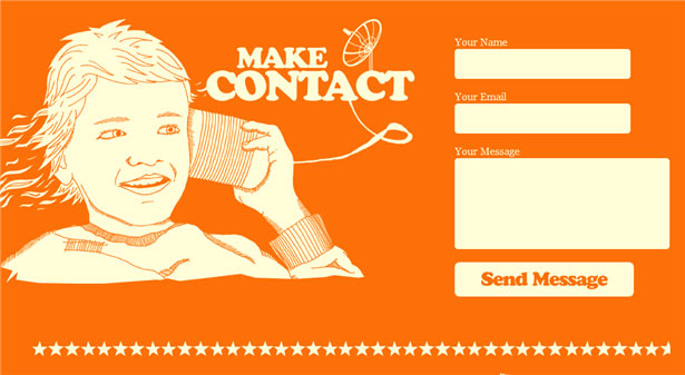 Image Source: 25 Impressive Contact forms
Call to Action
A strong call to action can make or break a form. Using the word, “Submit,” for example, can reduce conversions by as much as 3%. A call to action should clearly tell users what you want them to do and encourage them to take action. To create a unique call to action, try starting a sentence with, “I want to…” and see where it takes you.
Function and User Experience
When looking at forms, you need to have an inclusive view of everything you want it to do. Are you simply gathering contact information, to complete the sale later via email or phone? Or do you want to cut out the human element entirely, to integrate full scheduling and payment options? Do your homework. It doesn’t help if a form that integrates with your software is so complicated that the customer cannot figure it out, or if the interface is so complicated you need to hire someone with an computer engineering degree to operate it.
There are two distinct points of view to consider when choosing your form: the customer that will be using the form, and the business that will be using the information.
How Your Customer Uses It
Thanks to short form social media like twitter, people’s attention spans have decreased to about that of a goldfish. Let’s face it, how excited are you when you see a long and detailed contact form? Forms with less fields increase conversions, but not necessarily the quality of the leads. People that are willing to spend the effort and give more information are most likely already closed, or close to it. You need to find a balance between the two.
Begin by determining the information that your really need. Think about the information that is relevant to your sale. A plumber would have reason to ask for an address, where a web design company would not. And unless your business requires a post-click phone call, asking for a phone number can cause a 5% reduction in form conversions.
Example: Expedia removed the “Company” field from their booking form and saw an increase of $12 million a year in profit. Source
A form should be easy to use:
- Specific labels
- It’s best to avoid optional field completely, but make sure the required ones are clearly marked if you do use them
- Shortcuts, like a social media sign up, make it even easier for customers to sign up
- Consider inline validation, which provides real time feedback for each entry as it is completed, to avoid frustrating validation errors. (This is especially effective when asking for more complicated data, such as a postal code, or asking a user to generate and user name or password.)
- Avoid Captchas. Some captchas are too difficult even if your not a robot. Consider a Smart CAPTCHA, which only appears if it detects multiple submissions by the same IP address, or no CAPTCHA.
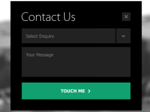
 Image Source:DesignBump
How You Use It
Most simple form plug in generate a standard email with the information that was submitted through the form. That’s all well and good, unless you are receiving 2,000 emails daily. Then what happens to those hot leads?
Streamline the sales process by using a form that integrates with your CRM. There are numerous forms that integrate with Salesforce, for example. If you use a different CRM, a quick Google search can suggest several form plugin that can seamlessly integrate. Online appointment forms, like this one from ContactUs.com, can even sync with your Google calendar.
You can always consider having a web development company customize a form with the exact functions that you need. This may not be essential, but it can reduce the risk of a form submission getting lost in an overcrowded inbox.
Don’t Forget about Mobile!
Phones and tablets are getting smarter and faster, but mobile forms still have more constraints than their desktop cousins, including screen size, connection speed, and tricky text entry. When considering mobile technology, think about the how the form will look across multiple platforms (iOS v Android, for example) and who will be using the form. The goal of a mobile form should be to get the user through the form quickly and easily as possible.