20 Apr #Mobilegeddon2015: Are You Ready?
In case you’ve been living under a rock for the past decade, mobile is kinda a big deal. In fact, more than half of global internet traffic (60%) coming from mobile browsing. Now Google is upping the SEO ante:
“Starting April 21, we will be expanding our use of mobile-friendliness as a ranking signal. This change will affect mobile searches in all languages worldwide and will have a significant impact in our search results. Consequently, users will find it easier to get relevant, high quality search results that are optimized for their devices,” – Google Webmaster.
Dubbed, “mobilegeddon” (#mobilegeddon, if you’re here from Twitter), websites that do not meet Google’s mobile friendly website design standards will be relegated to the dark recesses of search results, aka, demoted in the results for users searching from their mobile device. If you’re keeping track, that means that your non-responsive site will no longer show up in 60% of searches. Ouch. On the flip side, if your website is already mobile friendly by April 21, 2015 you may likely experience a surge in mobile traffic over your competition. So you can just kick back and enjoy your advantage over those that didn’t prepare for the update.
What exactly is “mobile-friendly” website design?
A mobile-friendly site is a website that is designed to adapt to whatever device someone is using. They could be using a smart phone or a tablet, and the site will re-organize and reformat content to fit their screen. Mobile content is designed to be more accessible and provide succinct information to consumers making decisions on the go. Still having a hard time convincing your boss that getting a mobile website is important?
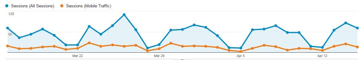 Check your analytics. This graph shows a traffic breakdown for a responsive website. Here, the blue line represents total traffic, and the orange line represents mobile traffic. Aproximately 25% of this website’s traffic comes from a mobile device.[/caption]
As you can see, traffic from mobile sources is significantly greater than other traffic types, signaling the importance of developing your mobile site. Furthermore, a well-developed mobile platform leads to more user “engagement,” an important metric in determining how long visitors stay on your site. Visitors that stay on your site contribute in the following ways:
- Increase in rankings. Good user experience = good SEO.
- Repeat visitors.
- The longer they stay on your page, the greater chance that they’ll buy something.
Mobile traffic is the future of online business, and failing to adapt could cost your business significantly. A mobile strategy is vital to getting new customers and keeping current ones. Developing your mobile site and creating engaging, relevant content will place you light-years ahead of the competition. Why wait? Act today!